[Question] Help in Model Development411
Pages:
1

|
SAM private msg quote post Address this user | |
| Greetings GS Community, I have a stream of Boolean type coming from my Motion sensor (True = Motion Detected). I would like to make an expression to show on my dashboard that can help me in the deriving the presence percentage during the day in the room where the motion sensor is located. Below is an example of the information that I would like to see at my dashboard. Room X has been 60% occupied during the day of Friday 6th of Aug, 2016. |
||
| Post 1 • IP flag post | ||
|
|
PigFarmer private msg quote post Address this user | |
| Hey Sam - your project seems cool. Would love to hear about it Do you get a new timestamp every time the condition changes? Do you want the percentage to be accurate once the day is complete OR do you want it to be accurate as the day passes as well? Meaning at noon there are still 12 hours left in the day - so your percentage on is 50% but its only been on 25% of the day? Anyway, I think you should start two different interval stream depending on how accurate you want the percentage to be, the more accurate you want it the smaller of an interval you make it. I would then create two new streams with this derivation: onoff 1 minute interval, derivation = if(isNull(var1),LAST_VALUE,var1) total 1 minute interval, derivation just put a 1 I think you can then create a new stream called percentageon, 1 minute interval, derivation = onoff / total ----- You could also perhaps screw around with taking the current timestamp - previous timestamp and only count it if it changes from 0 to 1 but then I am struggling to think of how you deal with midnight and counting those minutes in the correct day. Does this help or make it worse for you??? |
||
| Post 2 • IP flag post | ||

|
SAM private msg quote post Address this user | |
| Hey PigFram, thanks for the interest. I did not fully got your idea, appreciate more elaboration on it. Attached below is the bar chart for the motion sensor for a 5 min average value. 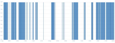 All I need is to convert this graph into a percentage that keeps updating, as more data is received. Additionally if I can specify the duration (part of the graph) and it calculates the percentage of the true to the false. |
||
| Post 3 • IP flag post | ||
|
|
PigFarmer private msg quote post Address this user | |
| Sorry, I was assuming you had something more complicated, essentially a random 1 or 0 every time a switch was turned on or off. If you already have the data in 5 minute intervals try a rollup with interval DAY and statistic AVERAGE If I am thinking about this problem correctly you will always have the average of the time the condition 1 was present. If I am still missing your problem...basically you need another stream that matches intervals with your other stream that you get the 1s and 0s in. The new stream is ALWAYS going to be 1 for that interval (sounds like you use 5 minutes). This is accomplished by just putting the number "1" in your derivation expression. Once you have this you can take the result that is feeding your chart and divide it by the new stream (eternal 1) and set the rollup to DAY and I would think use the statistic of AVERAGE again. Let me know if you have more questions!! Brad |
||
| Post 4 • IP flag post | ||

|
SAM private msg quote post Address this user | |
| Thanks Brad. It worked. Here is the final output. 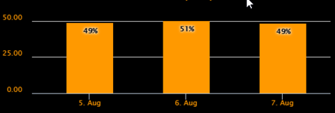 Now next step is to know the peak duration (2 hrs duration) among the day. |
||
| Post 5 • IP flag post | ||

|
SAM private msg quote post Address this user | |
| lets make 1 hr duration among all days. | ||
| Post 6 • IP flag post | ||
|
|
PigFarmer private msg quote post Address this user | |
| Sam, what do you mean by peak duration? What is the math look like for solving? | ||
| Post 7 • IP flag post | ||

|
SAM private msg quote post Address this user | |
| peak time. the hour that usually have largest number of motion among all days. | ||
| Post 8 • IP flag post | ||
|
|
PigFarmer private msg quote post Address this user | |
| Hmmmm....ok so take a 1 hour interval and use a SUM, I think that would give you essentially the total of the "1"s that returned during that hour. You could then bar chart that with a 1 hour interval and see it visually. What I think you want though is a grid that says today 2-3pm was the largest number of motion each day? There are lots of cool things you could do here... 1. I think you could easily do the hourly sum and bar chart over X days and see peaks and valleys for hour of day. 2. I think with somewhat more complex derivation you could get the hour of the day which had the highest count each day. 3. With a slightly even more complex set of derivation you could even take all 24 hours of the day and sum the previous x days (say 7 days) and show trending data of activity over previous x days. Lots of different ways to do it. If you need the grid that shows the hour of the day that was biggest each day reply to the thread and I will try to walk you through that. Hopefully just the hourly sum and bar chart work for you! |
||
| Post 9 • IP flag post | ||

|
SAM private msg quote post Address this user | |
alright I have presented the graph as suggested. here is the output  now from this graph, I need to know which hour is usually (on average) the most busy hour in the day for the a period of [start date of data record] till [current time] The output shall be like this 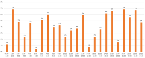 |
||
| Post 10 • IP flag post | ||
|
|
PigFarmer private msg quote post Address this user | |
| Just so I understand the output you will have 100 days (or whatever) of records, each new day you have another day to add to the tally. For each day there will be 1 hour that "wins" and that tally is kept in terms of a percentage each hour "wins" over the time period. What about if there is a tie? If you want ties to both count that makes it a little more difficult! I might need to think about this one or bring in someone smarter. I am thinking along the lines of a rolling comparison at 1am check if 1am is higher count than midnight, then at 2am check if its higher than 12 or 1 etc but I might be overthinking it Answer whether you want 1 hour per day to win and then graph it out. or how you want that second chart to populate Also that second chart might requre a new type of graph. I don't think you can have a time period like that on the bottom. It could be displayed in a grid but not a bar chart. |
||
| Post 11 • IP flag post | ||

|
SAM private msg quote post Address this user | |
| The chart shall populate it self everytime new reading is received from the sensor. The logic could be the following.. 1) At time (t0) "Data Record start date", there shall be a table for all the time durations mentioned in the second graph (the whole 24 hours). (example shown below) 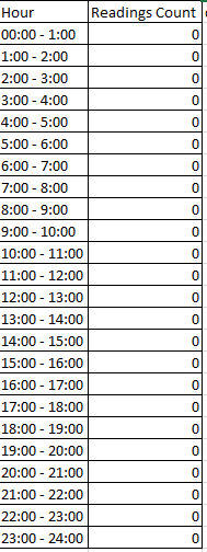 2) As we receive new readings from the sensor, the system shall add the number 1 to the reading to the existing count in the table with respect the time duration received. Example: assume we received 4 readings in the time duration 8:00 AM - 9:00 AM the system shall populate this table to look like following (update highlighted) 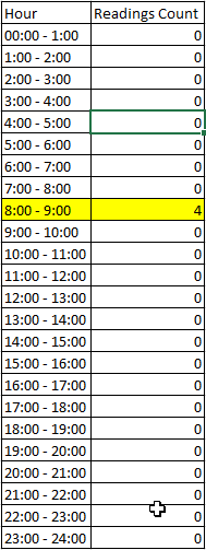 3) every time new reading is received the sum of reading counts for all durations shall be calculated and updated. 4) new column shall be derived to show the percentage of the count with respect of all other values as shown the sample table below 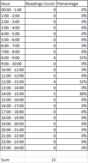 |
||
| Post 12 • IP flag post | ||

|
MikeMills private msg quote post Address this user | |
| You might want to try the new Pivot table and graphs. You could use the pivot table to view the top hours and graph them. | ||
| Post 13 • IP flag post | ||
Pages:
1