Is there a way to create a "binary graph"?152
|
|
minollo private msg quote post Address this user | |
| Trying to chart "binary states" of "things"; so, say you have a door which sends a "false" event at time 1 (closed); a "true" event at time 5 (open); and another "false" (closed) event at time 7. I don't want to see a normal line chart which connects (1, 0) to (5,1) to (7,0) with lines from one point to the other; I would like to see a chart where lines are only horizontal or vertical; so a horizontal line connects (1,0) to (5,0); then a vertical line goes (5,0) to (5,1); then another horizontal line goes (5,1) to (7,1); and finally a vertical line goes (7,1) to (7,0). Makes sense? Is it possible? |
||
| Post 1 • IP flag post | ||

|
MikeMills private msg quote post Address this user | |
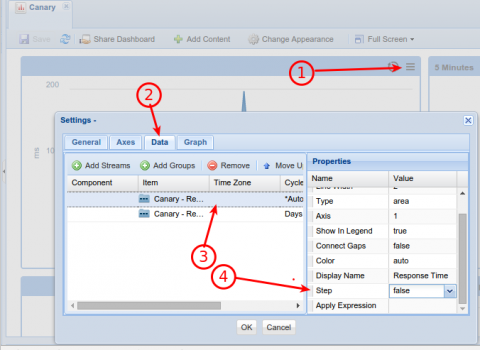
I think I understand what you want. That option is not there today, but it seemed like a trivial enhancement so we just implemented it. It will arrive when we update the production site which should be within a week.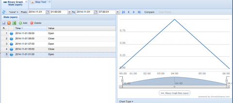 The chart "Step" option is not available as a configuration option within the Stream View tab, but is available as an option for the line chart dashboard widget. Note that this stream has a value type of "boolean" with a unit that has boolean formatting set as closed/open. A true value will indicate closed. False is graphed as zero, true as 1. 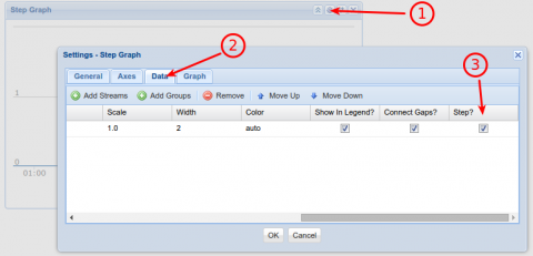 Create a dashboard, drop a line widget on it, drop your stream on it, edit its settings to show the stream/series as a step line. Step is not enabled by default. 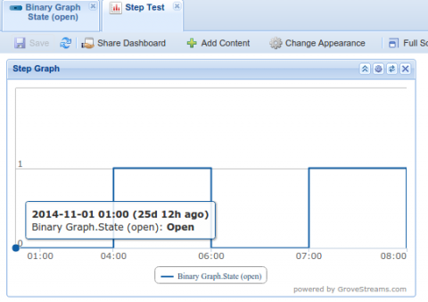 This is the result. |
||
| Post 2 • IP flag post | ||
|
|
minollo private msg quote post Address this user | |
| Yes, that's exactly what I meant; looking forward to the update! Thanks. |
||
| Post 3 • IP flag post | ||

|
MikeMills private msg quote post Address this user | |
| Step graphs are now available within the production site. | ||
| Post 4 • IP flag post | ||
|
|
minollo private msg quote post Address this user | |
| Perfect! Thanks! | ||
| Post 5 • IP flag post | ||
|
|
steveb private msg quote post Address this user | |
| ah, excellent - I was trying to bodge this a few weeks ago with a boolean input and had loads of trouble and wished that instead I used an integer stream and passed it values of 0 and 1000 instead to indicate on and off - however the purist in me kept it a boolean. I'll take a look and see if this works for me but it should - I'm trying to plot temperature (received by components in the house) overlaid with the status of the heaters in the room (on or off) just to try and understand the correlation. Thanks |
||
| Post 6 • IP flag post | ||
|
|
ero4444 private msg quote post Address this user | |
| I have applied the step feature, but have never been able to show a two-state sensor on a line chart. One example is "contact" with events of datetime and true/false; "temperature" from the same sensor is already charting OK. Another example is "presence" with datetime and true/false which also does not chart. My temperature and power charts are mostly fine. Is anybody getting a good 1/0 step chart? |
||
| Post 7 • IP flag post | ||
|
|
minollo private msg quote post Address this user | |
| One thing I noticed is that in those cases you want to make sure the stream's data type is set to Boolean (it's part of the Component's properties). | ||
| Post 8 • IP flag post | ||
|
|
ero4444 private msg quote post Address this user | |
| Ooo-kay, thanks Minollo. I finally got this going, and it was not clear to me how so I will add some details that I will probably need to figure this out again a year from now. My data is coming from SmartThings devices via SmartApp which sends streams to GroveStreams. At Grovestreams/ ObservationStudio/ Components-tab/ pick-the-component/ right-click/ editComponent/ pick-the-stream/ GeneralPropertiesTab/ DataType/ boolean(1 byte, it was originally "string" ). Then the line widget can portray True/False values and the step-checkbox is helpful. Otherwise the points did not appear and values indicated "NaN" on the widget. Mr. Mills, I propose a feature that would help to show multiple booleans on one line widget, that is an adjustable vertical offset for each stream, so each next boolean line does not have to display directly over the previous boolean line, on a single line widget. OOPS well nevermind - I/you can already do this to some degree with multiple axes. GREAT! Anyway, this boolean chart is a great feature and does indeed work, which is new to me. |
||
| Post 9 • IP flag post | ||

|
MikeMills private msg quote post Address this user | |
| Glad you figured it out. The reason your stream was a string value type, was because, without using a component template, gs guesses the type of the stream using the first sample uploaded. It tries to convert it to a number. If it succedes, it will be type double. If it fails, it will be a string. Maybe we should attempt a boolean check too.. | ||
| Post 10 • IP flag post | ||

|
lex private msg quote post Address this user | |
| sorry to bump an old thread, but I cannot find "step" option in the dashboard widget. does it still exist? thanks |
||
| Post 11 • IP flag post | ||

|
lex private msg quote post Address this user | |
hmm I don't see that setting. I see the following: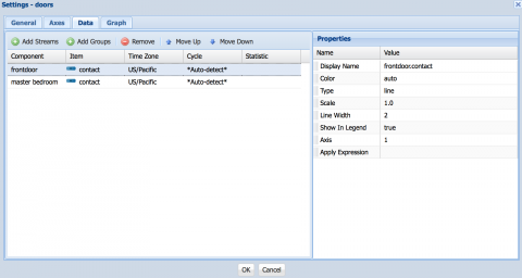 thanks |
||
| Post 13 • IP flag post | ||

|
MikeMills private msg quote post Address this user | |
| Ooops. Looks like our changes last week dropped the settings "steps" and "connect gaps" from newly created widgets. We've created a patch and will apply it in the next couple of days. | ||
| Post 14 • IP flag post | ||
|
|
TravisR100 private msg quote post Address this user | |
| Thought I was going crazy until I read to the end here and see that it's not currently working. | ||
| Post 15 • IP flag post | ||

|
MikeMills private msg quote post Address this user | |
| Finally applied the patch. Hit F5 to pickup the changes and it will appear. | ||
| Post 16 • IP flag post | ||
|
|
TravisR100 private msg quote post Address this user | |
| Thanks! | ||
| Post 17 • IP flag post | ||
|
|
TravisR100 private msg quote post Address this user | |
| I should probably start another thread for this, but is there any way to do stacked graphs with a single "navigator" at the bottom? In another words, instead of having to put my HVAC (I have 3 of them) on/off state (which would be step graphs) and my energy usage all on a single graph it would be less cluttered to have stacked graphs. In this case 4 of them where I can easily see the on/off state of each HVAC unit separately and the energy usage also on a graph by itself at the top. Does this make sense? | ||
| Post 18 • IP flag post | ||

|
MikeMills private msg quote post Address this user | |
| Stacking is all (series) or nothing with the chart we use. Would having multiple axes help solve this? If I understand you correctly, you could put the step series on one axes and then put the energy series on a second axes. I've never played with multiple axes and stacking so I don't know if that will get you what you want. |
||
| Post 19 • IP flag post | ||
|
|
TravisR100 private msg quote post Address this user | |
| Take a look at the top graph on this page. http://www.dashboardinsight.com/dashboards/product-demos/datamontage-dashboard.aspx It's actually 3 graphs stacked on top of each other with a common x axis for all 3. Does that better explain it? |
||
| Post 20 • IP flag post | ||
|
|
TravisR100 private msg quote post Address this user | |
| Here's another good example I see frequently. Top graph on this page. http://www.simple-stock-trading.com/online-stock-charts.html The stock price is in the top graph and the volume is in the bottom graph. They share the same x axis (time) but each graph has a different y axis. The top y is the stock price and the bottom y is the volume. If you tried using a single graph to show this it would look very cluttered. |
||
| Post 21 • IP flag post | ||
|
|
ero4444 private msg quote post Address this user | |
| 2 ways to do that. make 4 charts oriented on top of each other, with redundant X axes for which you selected the same rolling time range. or make 1 or 2 charts/graphs, and offset the Y-values vertically. I do something like this but just offset them only a tiny bit so they overlap, and I think there is a spacing problem if I don't use the Y-axis legend so that is a little blurred with overlapping text. I'll try to upload an example that shows both arrangements. 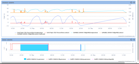 I just noticed since the right Y-axis legend of the top chart is bigger, the time scales are not quite the same. You can probably format that error away. |
||
| Post 22 • IP flag post | ||
|
|
TravisR100 private msg quote post Address this user | |
| Driving right now but will take a closer look in a bit. The offset function alone may do exactly what I'm looking for. Not sure why you'd need 2 or 4 charts. | ||
| Post 23 • IP flag post | ||
|
|
TravisR100 private msg quote post Address this user | |
| I also see neither of your examples is using the navigator. If you use multiple charts how do you get the navigator to control them both at the same time? | ||
| Post 24 • IP flag post | ||
|
|
TravisR100 private msg quote post Address this user | |
| Like this! http://automation.rciis.com Single navigator controlling two separate graphs. In this example they're showing the same data but I could easily show two different sets of data. |
||
| Post 25 • IP flag post | ||

|
MikeMills private msg quote post Address this user | |
| We do not support that today. But, it appears the graphing package we use does support multiple graph panes. We'll add it to our feature request list. If you're good at coding or have access to developers, you can use our API in combination with a charting package (like the one we're using) and build your own web page. |
||
| Post 26 • IP flag post | ||
|
|
TravisR100 private msg quote post Address this user | |
| Appreciate you adding it to the list. The example I posted was created by a developer in my office who was playing around with capturing the data on one of our servers. Not sure what graph package he was using for the graphs. | ||
| Post 27 • IP flag post | ||
|
|
TravisR100 private msg quote post Address this user | |
| Back to the stepped graph discussion, I finally got around to trying it this morning. I have a graph widget with a single data stream on it that is a door open/close sensor. I have the data type to binary, I've selected step as the graph type. I do indeed get a step graph but it looks like a perfect square wave. The distance between the vertical lines on the graph is perfectly equal. Does that make sense? I'm sure I've got some setting wrong but can't figure out what it is. | ||
| Post 28 • IP flag post | ||
|
|
TravisR100 private msg quote post Address this user | |
| When I use the binary sensor only as the data I get a perfect square wave. If I add temp to that graph I get the open/close events spaced properly. Not sure what I' doing wrong here. | ||
| Post 29 • IP flag post | ||
|
|
TravisR100 private msg quote post Address this user | |
| And ero444, I see what you did now in making those two graphs appear to be one on top of the other. It's still not really what I'm looking for. Multiple charts synced to one navigator would be ideal. Further refined my example... automation.rciis.com In my example you don't even have to stack the graphs. They can be side by side. Also, in grovestreams, what determines which set up data the navigator uses? I have two sets of data, the temp and the open/close contact. The navigator seems to be using the open/close data although it is a spline type. Any way to set the navigator to use specific data set or line type? |
||
| Post 30 • IP flag post | ||
