New Start Page - Beta230
Pages:
1

|
MikeMills private msg quote post Address this user | |
| We've been redesigning the start page and are looking for comments or feedback. You can hit the new start page here. What are we trying to accomplish? * Make the start page tablet and phone friendly * Provide dashboard links on the start page so that users do not need to enter Observation Studio to view their dashboards. Dashboards will pop-up in new tabs in the same style as shared dashboards. Why new tabs? We don't have to do that but we want to preserve the current layout of the start page (what panels are expanded and such). A new tab works great from a phone as I can click Go-Back and I go back to the expanded folders. Need feedback on this from you guys. * Allow organization administrators the ability to remove Observation Studio links from the start page. Now you can hide the the making-of-the-sausage from your friends and/or customers! 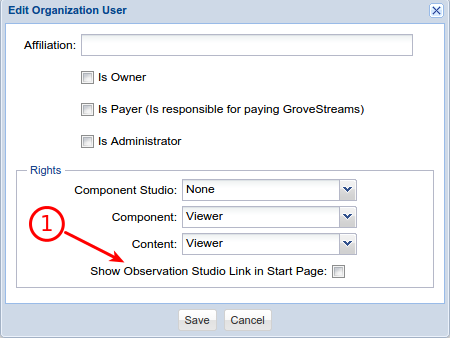 1: New organization user right above - Show Observation Studio Link in Start Page 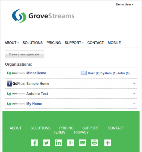 Example above of the new start page. Rows are a little wider for phones/tablets. The notifications link only appears if there are notifications. The icon will only appear on phones otherwise the text takes up too much space. Users can expand the org to see the notification text. 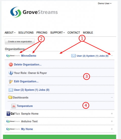 Example above for a user that has access to MinneDemo org and is the owner: 1: Clicking the white space or + button will expand the org 2: Clicking the logo or org name will open observation studio if the user has observation studio rights 3: Org action rows: Delete Org: Only org owners will see this Your Role: Only org owners or payers will see this Edit Org: Only users with observation studio rights will see this Notifications: All users will see this 4: Dashboards: Only users with Content-VIEW/EDIT rights will see this 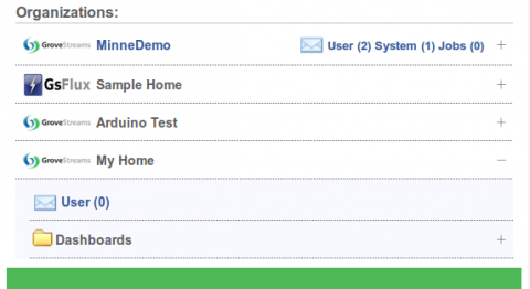 Example above of a user who who has access to My Home org and: - Is not the owner - Does not have obs studio rights - Has Content-VIEW rights Feedback appreciated. |
||
| Post 1 • IP flag post | ||

|
MikeMills private msg quote post Address this user | |
| Bumping up. | ||
| Post 2 • IP flag post | ||
|
|
Fenman private msg quote post Address this user | |
| Hello One of my customers has complained that the + button on the right hand side is too small and not at all obvious... Can this be made larger and more easily noticed ? Thank you |
||
| Post 3 • IP flag post | ||

|
evil_v private msg quote post Address this user | |
| 404 not found when i click the link | ||
| Post 4 • IP flag post | ||

|
MikeMills private msg quote post Address this user | |
| @Fenman Yeah, they don't stand out much. How about this? Old:  New:  Added a small tooltip to the buttons too. |
||
| Post 5 • IP flag post | ||
|
|
Fenman private msg quote post Address this user | |
| Yes that would be much better. Thanks | ||
| Post 6 • IP flag post | ||
Pages:
1